
Page 112 - Profile's Unit Trusts & Collective Investments - March 2026
P. 112
Chapter 6 Investment risk
Nevertheless, sector volatility averages give
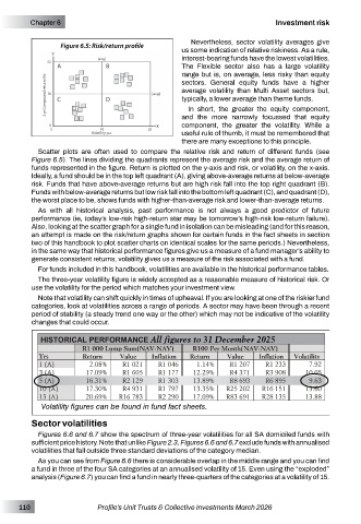
Figure 6.5: Risk/return profile
us some indication of relative riskiness. As a rule,
interest-bearing funds have the lowest volatilities.
The Flexible sector also has a large volatility
range but is, on average, less risky than equity
sectors. General equity funds have a higher
average volatility than Multi Asset sectors but,
typically, a lower average than theme funds.
In short, the greater the equity component,
and the more narrowly focussed that equity
component, the greater the volatility. While a
useful rule of thumb, it must be remembered that
there are many exceptions to this principle.
Scatter plots are often used to compare the relative risk and return of different funds (see
Figure 6.5). The lines dividing the quadrants represent the average risk and the average return of
funds represented in the figure. Return is plotted on the y-axis and risk, or volatility, on the x-axis.
Ideally, a fund should be in the top left quadrant (A), giving above-average returns at below-average
risk. Funds that have above-average returns but are high risk fall into the top right quadrant (B).
Funds with below-average returns but low risk fall into the bottom left quadrant (C), and quadrant (D),
the worst place to be, shows funds with higher-than-average risk and lower-than-average returns.
As with all historical analysis, past performance is not always a good predictor of future
performance (ie, today’s low-risk high-return star may be tomorrow’s high-risk low-return failure).
Also, looking at the scatter graph for a single fund in isolation can be misleading (and for this reason,
an attempt is made on the risk/return graphs shown for certain funds in the fact sheets in section
two of this handbook to plot scatter charts on identical scales for the same periods.) Nevertheless,
in the same way that historical performance figures give us a measure of a fund manager’s ability to
generate consistent returns, volatility gives us a measure of the risk associated with a fund.
For funds included in this handbook, volatilities are available in the historical performance tables.
The three-year volatility figure is widely accepted as a reasonable measure of historical risk. Or
use the volatility for the period which matches your investment view.
Note that volatility can shift quickly in times of upheaval. If you are looking at one of the riskier fund
categories, look at volatilities across a range of periods. A sector may have been through a recent
period of stability (a steady trend one way or the other) which may not be indicative of the volatility
changes that could occur.
All figures to 31 December 2025
Volatility figures can be found in fund fact sheets.
Sector volatilities
Figures 6.6 and 6.7 show the spectrum of three-year volatilities for all SA domiciled funds with
sufficient price history. Note that unlike Figure 2.3, Figures 6.6 and 6.7 exclude funds with annualised
volatilities that fall outside three standard deviations of the category median.
As you can see from Figure 6.6 there is considerable overlap in the middle range and you can find
a fund in three of the four SA categories at an annualised volatility of 15. Even using the “exploded”
analysis (Figure 6.7) you can find a fund in nearly three-quarters of the categories at a volatility of 15.
110 Profile’s Unit Trusts & Collective Investments March 2026