
Page 195 - Profile's Unit Trusts & Collective Investments - September 2025
P. 195
Fact sheet tips
declared one dividend (although its future policy is to pay two distributions a year) the yield will
therefore be understated compared to the fund’s peers.
Note that the yield fluctuates daily due to changes in the price (NAV) of units – more up-to-date
figures are available daily or weekly in many newspapers and online. The yield is not a guarantee of
future income flow from the fund, it is purely an historical figure. At best it provides a rough indication
of the yield that might be expected from a fund if conditions over the past year were to persist.
Distributions and calculated yields are gross (ie, before deduction of DWT). After April 2012, the
actual historical yield enjoyed by an individual investor subject to DWT will therefore be slightly lower
than the yield shown in the fact sheet.
Note that a different methodology is used in the distribution tables in fact sheets for Money Market
funds. See the previous page for more information.
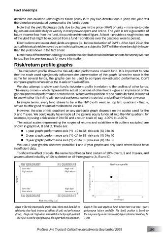
Risk/return profile graphs
The risk/return profile shows the risk-adjusted performance of each fund. It is important to note
that the scale used significantly influences the interpretation of this graph. When the scale is the
same for several funds, the graphs can be used to compare risk-adjusted performance. Don’t
compare graphs when either the X-axis or Y-axis differs.
We also attempt to show each fund’s risk/return profile in relation to the profiles of other funds.
The empty circles – which represent the actual positions of other funds – give an impression of the
general pattern of performance across funds. Whatever the position of one particular fund, it is useful
to see whether it is in line with general performance for the period, or significantly better or worse.
In simple terms, every fund strives to be in the NW (north west, ie, top left) quadrant – that is,
strives to offer good returns at moderate to low risk.
However, the size of this quadrant on any particular graph depends on the scales used for the
X and Y axes. We could easily have made all the general equity funds fall into the NW quadrant, for
example, by using a risk scale of 0 to 50 and a return scale of, say, -100% to +100%.
The actual scales (representing the ranges of returns and volatilities with outliers excluded) are
shown in graphs A, B and C. These are:
1 year graph: performance axis (Y) -19 to 32 | risk axis (X) 0 to 40
2 year graph: performance axis (Y) -14 to 35 | risk axis (X) 0 to 40
3 year graph: performance axis (Y) -10 to 35 | risk axis (X) 0 to 38
We use 3-year graphs wherever possible; 1 and 2-year graphs are only used where funds have
insufficient data.
To show the effect of scale, the same hypothetical fund (return of 10% over 1, 2 and 3 years, and
an annualised volatility of 10) is plotted on all three graphs (A, B and C).
Figure 1: The risk/return profile graphs show where each fund falls in Graph A: This scale applies to funds where there is at least 1 year’s
relation to other funds in terms of riskiness (X axis) and performance performance history available. The fund’s position is based on
(Y axis). A high-risk / high return fund will fall in the top right quadrant the lump sum figure and the volatility figure (standard deviation) for
– the closer it is to the top right corner, the higher both risk and return. 1 year.
Profile’s Unit Trusts & Collective Investments September 2025 193