
Page 196 - Profile's Unit Trusts & Collective Investments - September 2025
P. 196
Fact sheet tips
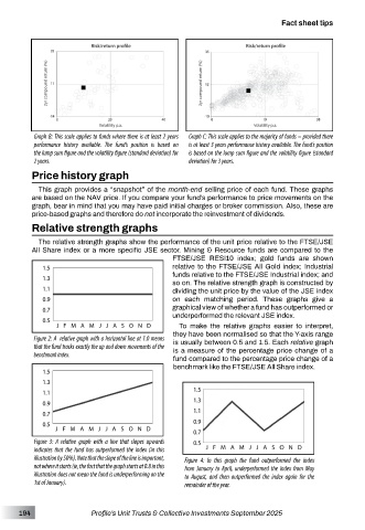
Graph B: This scale applies to funds where there is at least 2 years Graph C: This scale applies to the majority of funds – provided there
performance history available. The fund’s position is based on is at least 3 years performance history available. The fund’s position
the lump sum figure and the volatility figure (standard deviation) for is based on the lump sum figure and the volatility figure (standard
2 years. deviation) for 3 years.
Price history graph
This graph provides a “snapshot” of the month-end selling price of each fund. These graphs
are based on the NAV price. If you compare your fund’s performance to price movements on the
graph, bear in mind that you may have paid initial charges or broker commission. Also, these are
price-based graphs and therefore do not incorporate the reinvestment of dividends.
Relative strength graphs
The relative strength graphs show the performance of the unit price relative to the FTSE/JSE
All Share index or a more specific JSE sector. Mining & Resource funds are compared to the
FTSE/JSE RESI10 index; gold funds are shown
relative to the FTSE/JSE All Gold index; Industrial
funds relative to the FTSE/JSE Industrial index; and
so on. The relative strength graph is constructed by
dividing the unit price by the value of the JSE index
on each matching period. These graphs give a
graphical view of whether a fund has outperformed or
underperformed the relevant JSE index.
To make the relative graphs easier to interpret,
they have been normalised so that the Y-axis range
Figure 2: A relative graph with a horizontal line at 1.0 means is usually between 0.5 and 1.5. Each relative graph
that the fund tracks exactly the up and down movements of the is a measure of the percentage price change of a
benchmark index. fund compared to the percentage price change of a
benchmark like the FTSE/JSE All Share index.
Figure 3: A relative graph with a line that slopes upwards
indicates that the fund has outperformed the index (in this
illustration by 50%). Note that the slope of the line is important, Figure 4: In this graph the fund outperformed the index
not where it starts (ie, the fact that the graph starts at 0.8 in this from January to April, underperformed the index from May
illustration does not mean the fund is underperforming on the to August, and then outperformed the index again for the
1st of January). remainder of the year.
194 Profile’s Unit Trusts & Collective Investments September 2025